In the previous post I analyzed a 12-yr long crime data from 2011 to 2022 in the city of Baltimore, and described the yearly trends and spatial patterns observed in the crime activity. Here I talk about how to model this data to predict crimes anywhere in the city. I chose year 2022 data to develop and test this model, updated from year 2021 at the time of posting (my reasoning for using 1-yr data rather than the entire 12-yr dataset is stated below).
I’ll specifically discuss the popular Kriging model, which belongs to a suite of spatial models that use crime data reported at a set of locations to interpolate values at new locations. Simply put, the kriged prediction at an unobserved location is an weighted average of the observed data. These weights are computed so as to minimize the variance of the prediction error. I’ll skip a discussion of the theory of kriging here (the topic is mathematical and outside the scope of this post; a simple intro can be found here).
To minimize prediction variance, first we need to compute the variance itself, which results from spatial correlations in the data. These correlations are driven by regional economic, social and other factors; for example, differential impact of COVID in recent times may have contributed to overall higher crime activity in some neighborhoods than in others. Such correlations generate the non-homogeneous clustering patterns of crime distribution in Baltimore, the clusters typically ranging from a block up to several neighborhoods. The variance, which is inverse of correlation, is computed from the data using a variogram.
Variogram
First step in coding for variogram is to prepare the data (after downloading the raw data from here and cleaning it up) by extracting only the relevant information needed for the variogram. This is done with the R code snippet below:
# attach packages
library(dplyr)
library(caret)
library(sp)
library(gstat)
library(raster)
library(Metrics)

# get crime data
crime_df <- read.csv("CrimesData.csv") %>%
    dplyr::filter(grepl("2022", Date)) %>%                           # use 2022 data
    dplyr::select(Description, long = Longitude, lat = Latitude)     # select only needed columns

# get shapefile data for Baltimore city (needed to assign projection)
baltimore_shp <- raster::shapefile("Baltimore.shp")

# function to get count of crime at each location for each crime type
get.count <- function(df) {
    df <- df %>%
        dplyr::group_by(long, lat) %>%                  # group data by location
        dplyr::count() %>%                              # find total count for each location
        dplyr::ungroup() %>%                            # ungroup data
        dplyr::distinct(long, lat, .keep_all = TRUE)    # get unique locations
}
# use lapply() to loop over crime types (to get count for each type at each location)
type <- list(assault = "Assault", robbery = "Robbery", shooting = "Shooting",
             homicide = "Homicide", rape = "Rape")
crime <- lapply(type, function(x) subset(crime_df, Description == x) %>% get.count())
First I simplified the data by selecting only the columns describing the type and location of crime. I also imported the shapefile of Baltimore city, which will be used to assign correct spatial projections to the data (this step is only needed because I used the shapefile to create the kriging interpolation grid, see below). Next I computed total count of crimes of each type at each unique location. As described before, I’ve considered assault, robbery, shooting, homicide and rape as violent crimes.
Now that the data is ready, let’s get variogram! The code piece below does exactly that.
# train/test split
set.seed(42)              # set random generator seed for reproducibility
split.data <- function(df) {
    trainIndex <- caret::createDataPartition(df$n, p = 0.75, list = FALSE)
    list(train = df[trainIndex, ], test = df[-trainIndex, ])
}
type <- list(
    assault = crime$assault, robbery = crime$robbery, shooting = crime$shooting,
    homicide = crime$homicide, rape = crime$rape
)
dl <- lapply(type, split.data)

# collect train/test data
train <- list(
    assault = dl$assault$train, robbery = dl$robbery$train, shooting = dl$shooting$train,
    homicide = dl$homicide$train, rape = dl$rape$train
)
test <- list(
    assault = dl$assault$test, robbery = dl$robbery$test, shooting = dl$shooting$test,
    homicide = dl$homicide$test, rape = dl$rape$test
)

# function to get variogram
get.variogram <- function(df, form) {
    sp::coordinates(df) <- ~ long + lat         # attach coordinates
    sp::proj4string(df) <- crs(baltimore_shp)   # assign longlat proj from shapefile
    v <- gstat::variogram(form, df)             # empirical variogram
    vfit <- gstat::fit.variogram(v, model = vgm(model = c("Sph", "Exp", "Mat", "Gau", "Ste")))
    list(v = v, vfit = vfit)
}
form <- n ~ long + lat     # formula for universal kriging
vg <- lapply(train, get.variogram, form)
To start with, I split the dataset 3:1 ratio into training and test data for each crime type; the training data is used to build/train the model, and the test data to evaluate model performance. The createDataPartition() function in the caret package creates balanced splits by preserving the internal structure of the data, thus maintaining consistency of analysis across splits. To compute variogram, the standard data frame needs to be spatially formatted by attaching spatial coordinates to each data point, and assigning projection info if there is none (which is the case here). Projection coordinates are obtained from the Baltimore shapefile, which is used to create the interpolation grid needed for kriging below. Next I computed the empirical variogram with the training dataset, and fitted the best possible model from among a few, for each crime type.
The variogram formula used here is suitable for a particular type of kriging known as universal kriging, which accounts for any spatial trend (not to be confused with yearly trends) in the crime distribution. The formula models the number of crimes as a function of the linear combination of coordinates, which is an overly simple way to model non-homogeneity in space, such as clustering or spatial correlation in the data. By comparison, both ordinary and simple kriging assume homogeneous distribution, and model crime activity as equal to the constant mean value.
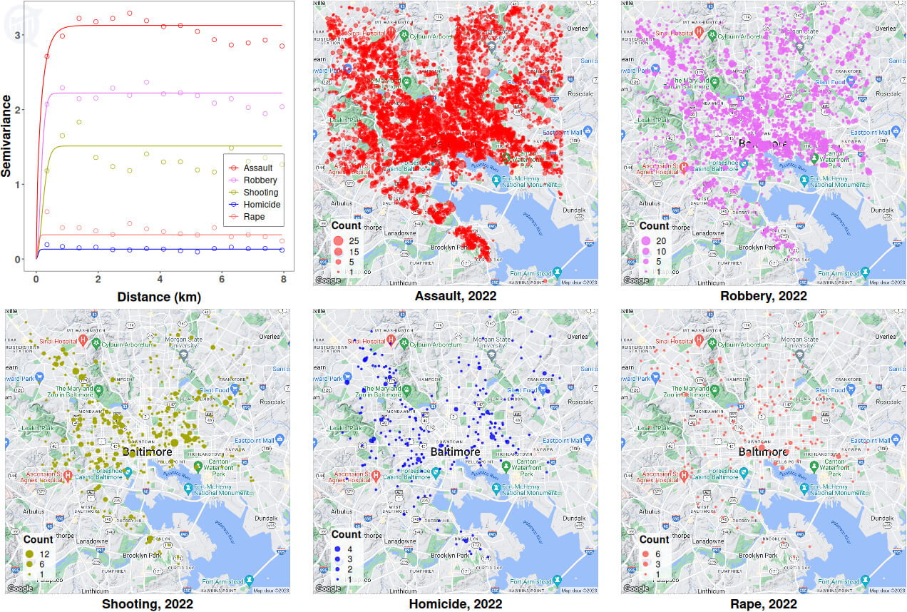
Image below shows the empirical variogram for each crime type, and the best fitted lines from the corresponding variogram models; also shown alongside is the distribution of each crime type in the city of Baltimore for year 2022.

All variogram plots have the usual shape of rising fast with distance before reaching a plateau, which correspond to decreasing spatial correlation as distance increases, eventually the data points becoming uncorrelated from each other (variance is inverse of correlation). An empirical variogram, unlike the fitted lines, is rarely smooth, and the wavy nature of the plots at large distances may suggest the presence of some kind of spatial periodicity, or even spartio-temporal structure (more on this below), in the data.
Another thing to note is that the quantity of data affects the quality of the variogram and hence model performance. From the distribution plots, assault-related crimes are far more common (~70% of all crimes, see here) and more densely distributed throughout the city area, compared to other types. The relative scarcity of robbery/shooting/homicide/rape incidences suggest low to negligible spatial correlation in these datasets; since spatial correlation is key to spatial modeling, I’ll focus only on assault data for model development below.
Kriging
Crime prediction:
Let’s take a look at the best fitted variogram model for the 2022 assault (training) data:
> vg$assault$vfit
1  model     psill      range kappa
     Ste  3.127471  0.2553776   0.3
This is a Matern class model with M. Stein’s parameterization, with the fitted sill value of 3.128 (height of the plateau), range 0.255 (minimum distance to plateau), and kappa 0.3 (smoothness parameter). Let’s code for kriging:
# function to run krige
run.krige <- function(df, vfit, grd, form) {
    sp::coordinates(df) <- ~ long + lat
    sp::proj4string(df) <- crs(baltimore_shp)
    krg <- gstat::krige(formula = form, locations = df, newdata = grd, model = vfit)
    data.frame(krg@coords, pred = krg@data$var1.pred)
}

# create grid from baltimore shape file
grd <- sp::spsample(baltimore_shp, type = "regular", n = 50000)
colnames(grd@coords) <- c("long", "lat") # rename coords

# run krige
krgout <- run.krige(train$assault, vg$assault$vfit, grd, form)
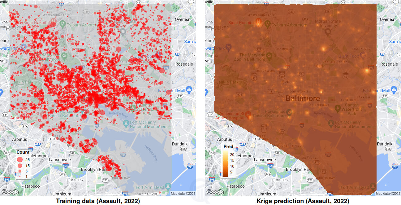
Kriging algorithm uses the training data, the variogram model, and the universal kriging formula described above, to interpolate (or predict) the number of assault-related crimes at a new set of locations. These new locations are supplied by means of a set of 50,000 randomly sampled grid coordinates, generated from the Baltimore shapefile to match the spatial extent of observed data; if the shapefile is not available, a rectangular grid works just fine.

Images above show the assault distribution for year 2022 on the left (Baltimore shapefile overlaid in light grey), and the predicted distribution on the right; low to high crime activity is colored from darker to lighter shades of yellow. Comparing the two images, it is not difficult to see a close correspondence between some of the brighter yellow spots on the right and high-crime activity “bubbles” (count >=20) on the left.
Model comparison:
The quality of prediction can only be assessed by comparing the outcome with a similar model. Here I am using the model IDW (short for Inverse Distance Weighting), which is a deterministic interpolation model unlike Kriging; IDW does not require correlation or variogram information, and instead computes interpolation as some inverse power of the distance, usually inverse-squared. IDW thus assumes a homogeneous distribution without any spatial trend in the data (similar to ordinary/simple kriging).
I computed predictions from both Kriging and IDW on a new grid made up of the locations of the test data itself. This allows for a direct comparison of the predictions with the observed crime activity on each location. The code below implements these steps:
# function to run IDW (no variogram needed)
run.idw <- function(df, grd, form) {
    sp::coordinates(df) <- ~ long + lat
    sp::proj4string(df) <- crs(baltimore_shp)
    idwout <- gstat::idw(formula = form, locations = df, newdata = grd)
    data.frame(idwout@coords, pred = idwout@data$var1.pred)
}

# create grid from test data
test_grd <- test$assault
sp::coordinates(test_grd) <- ~ long + lat
sp::proj4string(test_grd) <- crs(baltimore_shp)

# run krige
krgtest <- run.krige(train$assault, vg$assault$vfit, test_grd, form)

# run IDW
form2 <- n ~ 1    # assume homogeneous field (no spatial trend)
idwtest <- run.idw(train$assault, test_grd, form2)

# compute RMSE error for test results
Metrics::rmse(test$assault$n, krgtest$pred)
Metrics::rmse(test$assault$n, idwtest$pred)
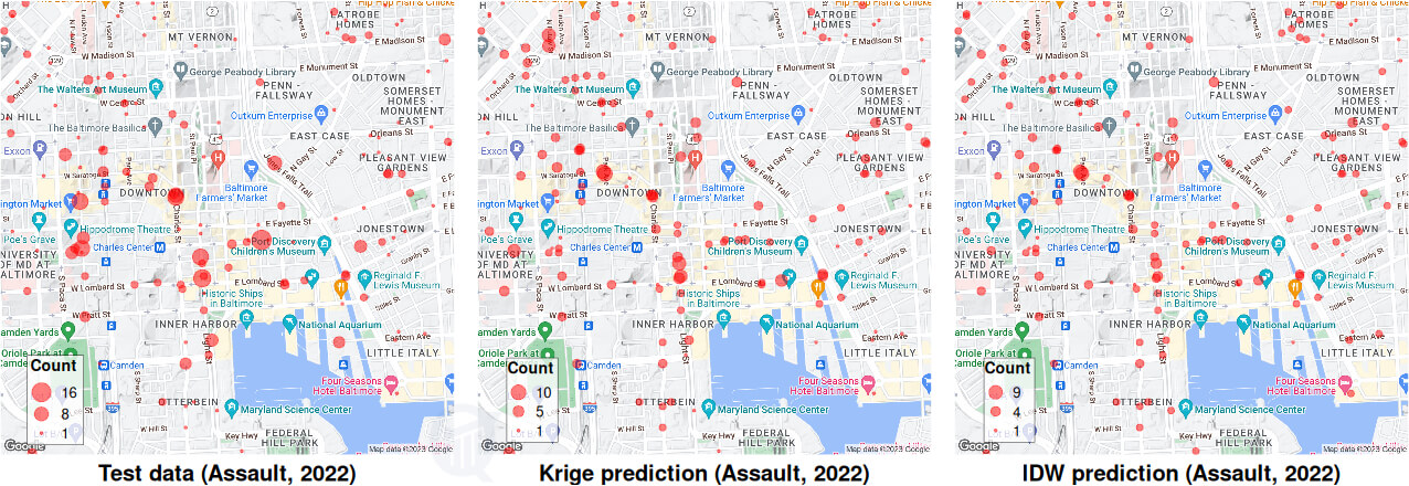
Last two lines of this code compute RMSE (root mean-squared error) of the predictions, when compared to the observed data: 2.564 for Kriging and 2.807 for IDW. Kriging is therefore the superior of the two, as expected. A better way to visualize the comparison is by plotting the data and the two predictions side-by-side, as shown below.

The map zooms into the downtown area for a clearer view of the streets and neighborhoods where the actual crimes occurred, and their corresponding predictions. Kriging and IDW plots look similar, with the former having an edge.
Caveat
A final point to note here. Variogram, Kriging, IDW are all spatial tools, and work well with strictly spatial data. Such data are made up of values at multiple spatial points (or coordinates) but a single time point, a “snapshot” in time; for example, housing prices in a zipcode or soil composition along river bank. These types of data have truly spatial correlations, which generate reliable variograms and model predictions.
By contrast, what we have here are data on crimes reported at multiple locations over multiple timescales spanning from hours to years, a spatio-temporal data. These data have correlations both in space and in time, and generally do not yield to a strictly spatial analysis. For example, two nearby data points represent crimes committed either simultaneously, which makes the two crimes spatially correlated, or over hours or days, which makes them spatio-temporally correlated. A variogram analysis cannot account for any temporal correlation, and will treat all correlations as spatial.
One way to get around this problem is by using a “thin time slice” of the data, for example, focusing on a single year, which is what I have done here. This makes the data a quasi-snapshot, compared to the entire 12-yr data set. Under some conditions a full space-time data can be used for spatial analysis, which requires the data to be stationary in time; that is, statistical distributions, moments or trends should not change with time. This is clearly not the case here, because of the strong yearly trends present in our data. A proper analysis of such data requires using spatio-temporal tools, which is a topic for another day.

Hi there! I am Roy, founder of Quantiux and author of everything you see here. I am a data scientist, with a deep interest in playing with data of all colors, shapes and sizes. I also enjoy coding anything that catches my fancy.
Leave a comment below if this article interests you, or contact me for any general comment/question.


